
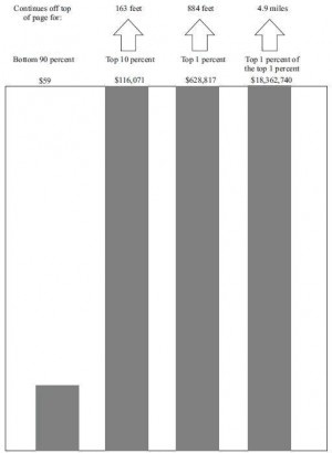
Here's a rather graphic representation of the growth in income inequality in the USA since the 1960s; plotted on a chart where the income growth of the bottom 90 percent is represented by an inch-high bar; the growth of the top 10 percent needs a 163 foot-tall bar; while the top 0.01% need a 4.9 mile-high bar to represent their real wealth growth in the same period.
